
Purple does a lot of work—if you let it
While the science is still in development to quantify the phenomenon, anyone who has argued with their spouse about which of the 30 available shades of white to paint the living room with knows how important color choice is. The two rooms in your space you are most likely to spend long stretches of time in are your home office and your bedroom. Let’s discuss how artwork, especially work with large purple elements, fits in.
The home office: steady, not performing
The office asks a lot of purple. It needs to be present without being distracting, interesting enough to earn its place on the wall, and contained enough to let you work.
The undertone is where this lives or dies. A purple that pulls toward blue (violet, plum, dusk) reads as calm and focused. It anchors a wall without demanding attention. A purple that pulls toward red or magenta is energetic and a little restless. That choice is better suited to a wall you're not facing directly, something you catch when you stand up to stretch.
Think of what you want from a good colleague: present, reliable, not dominating every meeting. That's what a well-chosen purple piece does in an office. It's doing its thing and lets you get on with your day.
If your walls are a neutral—white, warm gray, greige—almost any purple will work. If you already have color on the walls, hold the piece up before you hang it. See what the two do together. If they fight, one of them needs to move.
The bedroom: the other end of the day
If the office asks purple to help you focus, the bedroom asks it to help you let go. Same color, completely different job.
Cool purples—lavender, dusty violet, the muted mauve that reads almost gray in low light—have a desaturated quality that works like a long exhale. On a white or soft sage wall, a piece in those tones won't spike your energy before bed. It'll be there, doing something beautiful, without making demands. That's exactly what you want at the end of a day full of decisions.
Warmer, more saturated purples tip the room somewhere else: luxurious, a little dramatic. That's not wrong; it just depends on what you want the room to feel like. Pair richer purples with brass frames and cream walls and the whole thing feels considered. Pair cooler purples with white frames and pale linen and the room settles.
One thing to avoid: art that creates visual clutter. Purple carries a lot of weight. If you're hanging a big, complex purple piece, keep the rest of the walls spare. More than any other room, the bedroom is allowed to ask very little of you.
The kid's room: both jobs at once
Children's bedrooms aren’t just bedrooms: they’re play and (home)work spaces, too. A kid lives the rest/work tension in a single room. The art has to navigate it too.
Purple helps here because it's one of the few colors that can read as both energizing and soothing, depending on value and saturation. Bright, warm purples (grape, fuchsia-adjacent, a punchy lilac) carry the energy a kid's room needs during the day. Softer, hazier purples can hold the room gently at night without making the space feel babyish.
A common misstep is overdoing the layering: purple art plus a purple bedspread plus purple curtains, and suddenly the room has no air. Let the art do the heavy lifting. Keep bedding simple by leaning toward whites, perhaps oatmeal or a soft complementary color like pale yellow or warm green. The art reads as deliberate and the room can breathe easily.
Keep in mind for older kids: darker purples (aubergine, deep violet) can skew more grown-up, which might be exactly what a ten-year-old wants. Ask them.
The through line
What connects these three rooms isn't the color: it's the hours. You spend more time in your office and your bedroom than almost anywhere else at home. That time accumulates. The art on those walls accumulates with it, becoming part of the backdrop of your days and nights in a way a piece in the hallway simply doesn't.
Purple rewards sustained attention, shifting in different light, changing its character depending on what surrounds it. Choose the version that matches what the room needs to do, and then let it work.
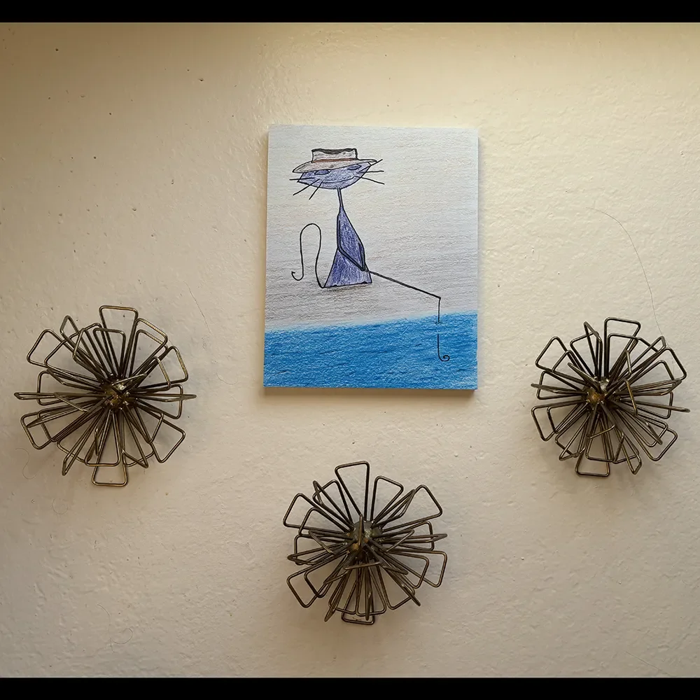
De-stress as you sit alongside Purple Cat next to the creek, cool breeze on your face. The fishing pole is just for show - you’re here for the power naps. Relaxing and calming for your bathroom or kid’s room.
Sizes
8" x 10"
11" x 14"
Archival substrate options
Paper
Black Gatorboard 3/16" panel
Canvas